Visual Hierarchy in Web Design: Guiding Users Through Effective Design
When you create a website, you aim to get the user’s attention. Your goal? Make them stay, explore, engage. This is where visual hierarchy plays a key role. It’s about arranging elements so visitors naturally gravitate toward the most important information first. This approach enhances the user experience. It guides them through your content effectively.
Imagine landing on a homepage. What catches your eye first? Often, it’s a large, bold headline. Next, you might notice a striking image, then a call-to-action button. This is the visual hierarchy at work. It directs your attention to ensure a smooth and intuitive journey through the site.
In this article, we’ll talk about visual hierarchy in more detail. We’ll explore its principles, how to implement them, and why they matter.
Understanding Visual Hierarchy in Web Design
Visual hierarchy in web design refers to the arrangement of elements to signal their importance. This concept is crucial. It dictates how a user perceives and interacts with a website. Think of it as the design’s way of communicating what’s most important. This communication guides users through a website’s content seamlessly.
Let’s consider examples to illustrate this.
-
First, size plays an important role. Larger elements grab attention faster than smaller ones. Hence, you will use bold and large headlines. They serve as entry points to the content.
-
Color also significantly influences user attention. Bright, contrasting colors draw the eye more effectively than muted, blending ones. A call-to-action button in a vibrant hue against a subdued background stands out. It prompts action.
-
Placement further directs attention. Strategic positioning of elements can guide the user’s gaze in a natural flow. Top-left placement aligns with how most people read. This makes it a prime spot for key information.
Together, these elements of visual hierarchy help you present a website beyond a collection of information. They help you provide a guided experience that leads users from introduction to action.
Principles of Visual Hierarchy
Visual hierarchy principles form the foundation of effective visual hierarchy in web design. Each one guides user attention and enhances the overall experience. Let’s see how these elements play their role in visual hierarchy.
-
Size: Users are naturally drawn to larger elements on a page. This principle helps designers emphasize key information, such as headings or featured products.
-
Color: Bright colors capture attention faster than muted tones. Designers use this to highlight important buttons or links, making them pop against the background.
-
Contrast: High contrast between elements ensures they stand out. It’s particularly effective for a text that makes it readable and draws attention to calls to action.
-
Alignment: Elements that break from an established alignment pattern catch the eye. You can use this to emphasize a message or content that needs to stand out.
-
Repetition: Repeating design elements suggests they are related. This can help create a sense of organization and coherence to guide users through related content sections.
-
Proximity: Users perceive closely placed elements as related. This principle can group related information, making the site easier to navigate.
-
Whitespace: Also known as negative space, whitespace around elements draws attention to them. It can give a design a clean, uncluttered look to make important elements more prominent.
-
Texture and Style: Textures and distinctive styles can make elements stand out. This can add depth to the design and draw the user’s eye to key areas.
Incorporating these principles into web design creates a visually appealing and user-friendly experience
Implementing Visual Hierarchy in Web Design
Implementing visual hierarchy in web design demands attention to detail across several key components. Each element should guide users through content with ease and precision.
Typography
Mastery in typography requires strategic variation in font sizes and styles to establish a clear order of information. Large, bold fonts often denote headings and signal their importance. On the other hand, smaller fonts are suitable for body text. This differentiation enhances readability and emphasizes critical information.
Imagery
Effective selection and placement of images help you direct the viewer’s gaze. You can leverage certain best practices to make the best use of images in web design.
-
Relevance: Choose images that closely align with your content’s themes.
-
Quality: Use clear, high-resolution images to project professionalism and ensure clarity.
-
Focus: Strategically place images to create focal points.
-
Optimization: Compress images to reduce load times.
-
Accessibility: Add descriptive alt text to images.
-
Infographics: Incorporate infographics for an engaging presentation of complex data.
-
Backgrounds: Use background images to subtly add depth and texture.
Layout Strategies
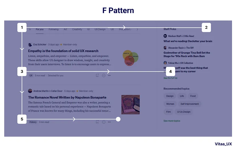
The organization of content on a page significantly affects how information is processed. F and Z patterns are proven layout strategies that cater to natural scanning habits.
-
An F pattern applies to text-heavy pages. It guides eyes from left to right and down in a shape that resembles the letter ‘F.’
-
Conversely, the Z pattern suits pages where you need simplicity and balance. It directs the gaze across the top, diagonally to the opposite corner, and then across the bottom – mimicking the letter ‘Z.’
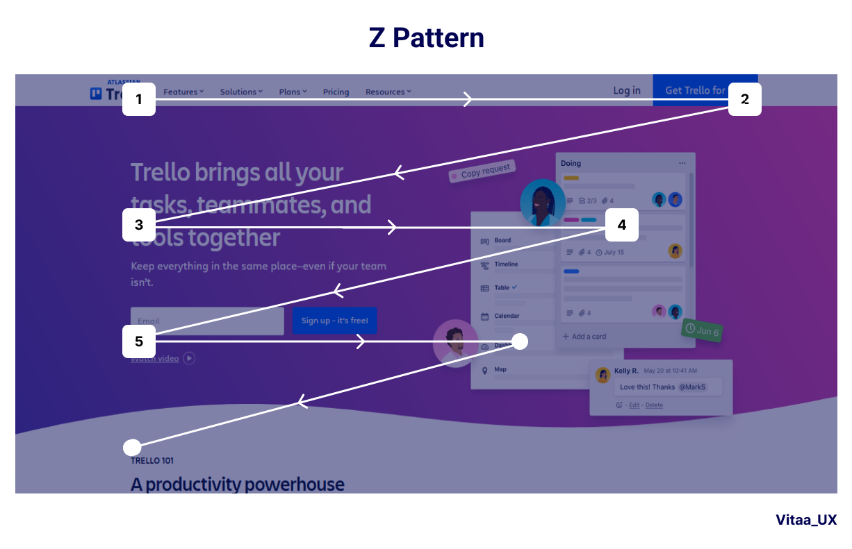
These patterns facilitate an intuitive flow to make crucial information noticeable.
Interactive Elements
Buttons and calls-to-action (CTAs) act as points of user engagement. They must stand out, compelling users to take the next step. This involves using contrasting colors, distinctive shapes, and dynamic effects to differentiate these elements from the rest of the content.
You need to place the buttons and CTAs strategically. The goal is to make them easily accessible when the user is ready to act.
Tools and Resources to Create Better Visual Hierarchy in Web Design
You have several tools available if you want to focus on visual hierarchy.
-
ruttl is a notable tool that is ideal for real-time website feedback and collaboration. It allows teams to edit and comment directly on live websites. This makes it invaluable for refining visual hierarchy.
-
Another recommended tool is Adobe XD. It’s perfect for prototyping and designing user interfaces with visual hierarchy in mind.
-
Sketch offers a wide range of plugins and features tailored for web design.
For inspiration and learning, website design blogs offer a wealth of information. Top web design blogs are rich resources with case studies, tutorials, and the latest trends.
Beyond blogs, Behance showcases creative projects from around the globe. Dribbble is another platform where designers share their work. It provides a glimpse into new design trends and ideas.
Final Thoughts
Visual hierarchy plays a pivotal role in web design as it guides users through content with intention and clarity. It guides attention to key elements and ensures a site’s objectives are met.
The challenge lies in balancing aesthetics and functionality. You want to create visually appealing designs that are highly effective in communication. So, focus on strategic placement, size, color, and contrast to master visual hierarchy.